CASESTUDY.CLUB
What's actually moving in design
The weekly read for designers who shape products. Signal, not noise. Every Monday.
Join 27,200 designers worldwide.
The weekly read for designers who shape products. Signal, not noise. Every Monday.
Join 27,200 designers worldwide.
|
| |||||||||||
| |||||||||||
|
| |||||||||||
|
Case Study Club
| |||||||||||
|
The weekly read for designers who shape products.
| |||||||||||
|
| |||||||||||
| |||||||||||
Taste vs judgement | |||||||||||
|
Some people think taste is the screenshots and images they save. I think judgement is a better word for what designers do: what you change in your own work, and why. | |||||||||||
|
Judgement happens every day, each time you touch your designs. Start from the first revision and iterate through to a better revision. From rev 1 to rev 5 is where all the judgement lies. | |||||||||||
|
In a CHI 2026 paper from Apple, 21 designers at the company gave feedback on AI-generated screens in four ways. Six researchers (HCI experts on the study team) then judged the same screens blind. This is how often they agreed with the designer: | |||||||||||
|
• Picking the better of two similar screens: 49.2% (guessing gets 50%). | |||||||||||
|
• A written comment: 57.3%. | |||||||||||
|
• A box on the screen with a note: 63.6%. | |||||||||||
|
• Changing the design directly: 76.1%. | |||||||||||
|
The team trained a model on each kind of feedback. Only the boxes and the revisions made it better. The iterations are what make the models "understand" your judgements. | |||||||||||
|
I tried this on my own work. My agents read my judgements, one line each, before every visual decision. When I replayed old work to fresh agents, the written lines alone didn't help. Agents that also saw my revisions came closest to my answer in the few times I've tested it. (I'm building this into Orbal for an upcoming release.) | |||||||||||
|
However, judgement is subjective, based on the designer's point of view. That point of view can hold personal judgement, and it can also be a collection of points of view: user feedback, stakeholder feedback, peer review. | |||||||||||
|
So does this mean judgement cannot be learned? Because it is subjective, and in the moment only relevant to one specific screen and does not affect other screens? | |||||||||||
|
Agreed judgement can be learned. In a team, it lives in three places: | |||||||||||
|
• Written principles, like "blue means act". On their own they are close to the written comments in the study, which made the model no better. | |||||||||||
|
• Components in the design system. They show the result, without the change that led to it. | |||||||||||
|
• Revisions that passed design review. They are the study's strongest signal. | |||||||||||
|
I think a model learns most from the revisions a team agreed on, with the principle written next to them. | |||||||||||
|
I'm still figuring this out. If you or your team write your judgement down, I'd like to see how. Reply to this email. | |||||||||||
|
Jan Haaland | |||||||||||
| |||||||||||
|
| |||||||||||
| |||||||||||
|
Luke Wroblewski shows how Intent, Sol and Aria keep their design systems in code, with an AGENTS.md file that tells every agent to reuse the same tokens and components. lukew.com | |||||||||||
|
| |||||||||||
|
Meta's Muse passed ChatGPT to reach No. 1 on Apple's US free chart ten days after launch. implicator.ai | |||||||||||
|
| |||||||||||
|
Lightspark built a prototype that turns money into a file you can drag out of a wallet and AirDrop. design.lightspark.com | |||||||||||
|
| |||||||||||
|
Love and Money drew Chunky Roll, a typeface for the 128 by 128 pixel screen on Orchid, the synth from Kevin Parker's Telepathic Instruments. It's Nice That | |||||||||||
|
| |||||||||||
|
Doug Powell and his students at Washington University in St. Louis surveyed 119 design leaders: fewer than 30% studied design at university, and more than 41% had no mentor early on. emergingpatterns.design | |||||||||||
| |||||||||||
|
| |||||||||||
| |||||||||||
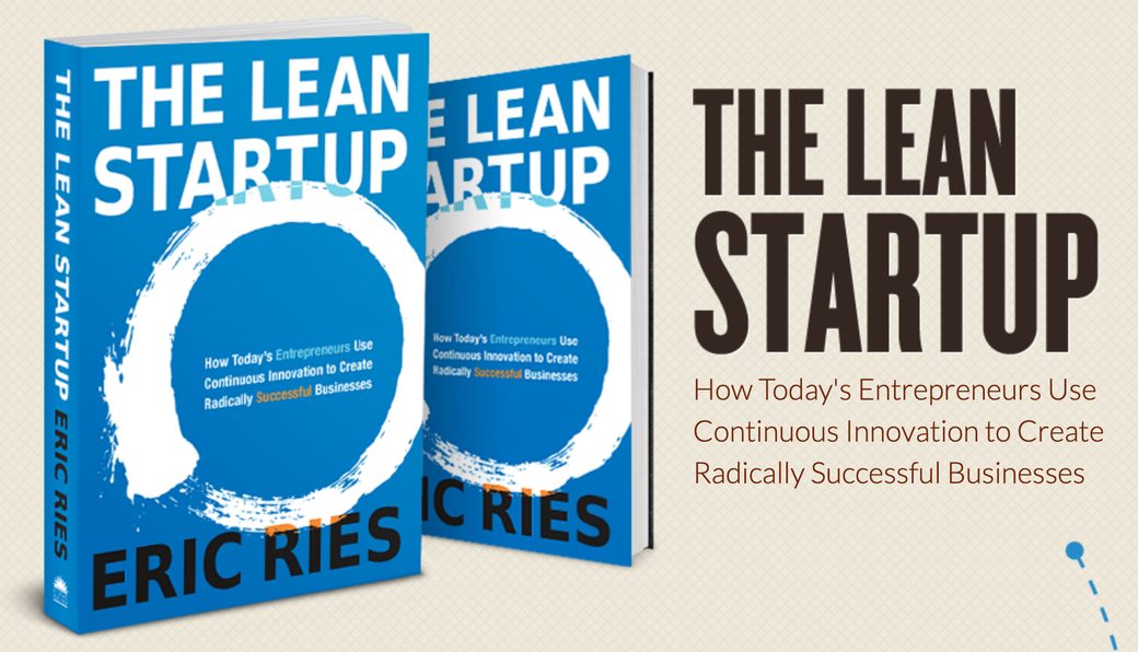
theleanstartup.com Eric Ries, 2011
| |||||||||||
The Lean Startup, 2011 | |||||||||||
|
Eric Ries published The Lean Startup in 2011. It taught founders and product teams to ship a minimum viable product and measure it. The goal was businesses that change the world. | |||||||||||
|
In a Design Observer podcast recorded at Aspen, Ries says he "forgot to say for the better." His new book, Incorruptible, is "both a sequel and a correction." | |||||||||||
|
| |||||||||||
| |||||||||||
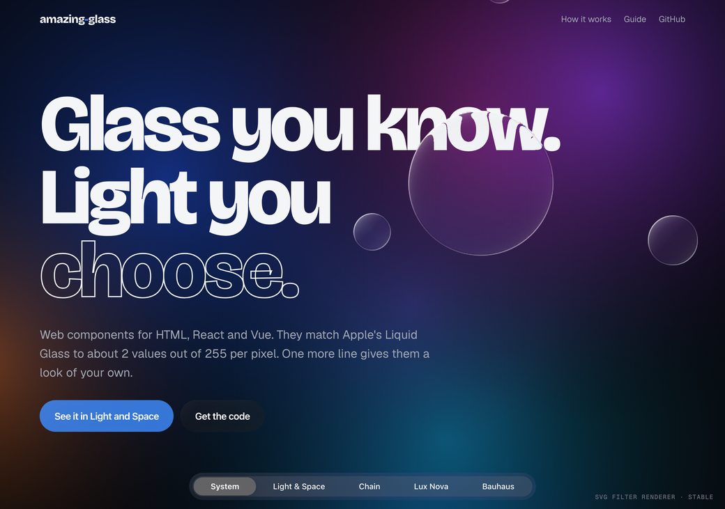
tomacco.github.io Iván González
| |||||||||||
Amazing Glass | |||||||||||
|
Amazing Glass by Iván González is a set of web components that bend the page behind them at their curved edges, like Apple's Liquid Glass. He tuned it against Apple's own renderer and says the average pixel is off by about 2 in 255. It works in plain HTML, React and Vue, and it is free and open source. The demo has sliders, menus, a tab bar and glass shapes that merge. Full refraction needs a Chromium browser; Safari and Firefox show a frosted version. | |||||||||||
|
| |||||||||||
|
Written and edited by Jan Haaland. Published weekly from Norway. | |||||||||||
|
Forwarding this to one person is the best way to support Case Study Club. If someone comes to mind, please send it their way. | |||||||||||
| |||||||||||
|
|
Hi, I'm Jan. I've been in design for 15 years. Through Web 1.0, Paint Shop Pro to Photoshop to Sketch to Figma, and now AI.
I started Case Study Club in 2015 as a newsletter. Ten years later, it's the publication I wish I had when I was trying to figure out what was actually changing in this industry, and what was just noise.
Alongside the newsletter I do consulting work that keeps me close to how teams are actually shipping. That's where the signal comes from.
If you're on LinkedIn, let's connect.
— Jan
The weekly read for designers who shape products. Signal, not noise. Every Monday.
Join 27,200 designers worldwide.
 Join 27,200 designers worldwide.